
How to visualize Passenger Flow in Public Transport Networks
Understanding how passengers move through stations, vehicles, and the wider network is essential for transit operators. Explore how video analytics turns raw movement data into clear, actionable passenger flow visualizations.
Published
September 3, 2026

Key Facts
- Passenger flow visualization helps transport planners and operators understand large data volumes quickly, supporting both long-term planning and real-time response.
- Visualization methods fall into two categories: local (stations/vehicles) and network-wide.
- Path maps show individual passenger journeys within a station, revealing common routes and occupancy patterns.
- Dwell time maps use color-coded heat maps to show how long passengers wait or linger in specific areas.
- Trajectory maps trace individual movement paths, useful for infrastructure design and retail placement decisions.
- Origin-destination (OD) matrices quantify how many trips occur between every station or zone pair, feeding directly into demand forecasting and capacity planning.
- Sankey diagrams visualize passenger volume and flow direction across a network, highlighting busy transfers and load imbalances at a glance.
- No single visualization gives the full picture. Combining them creates a complete, connected view of network-wide passenger behavior.
- Video analytics like Isarsoft can generate people counting, density, dwell time, and movement data simultaneously from existing security camera infrastructure to visualize passenger flow.
How does visualizing passenger flow benefit transport operators?
Visualization is instrumental in aiding transport planners to understand huge volumes of data easily and quickly. Analysis based on video data visualizations ranges from a long-term planning basis to a quick response trigger.
One of the primary reasons for visualization of the real situation with video analytics is the fact that it allows staff to respond quickly, whether it is a situation involving safety-critical factors or an event where staff deployment needs to be optimized.
How can people flow be visualized in public transport?
To explain adequately which options there are for visualizing passenger flow, we have compiled a list grouped by methods used locally in stations or vehicles and methods used network-wide.
In stations and vehicles
Passenger flow visualizations answer the question here "how do people move locally?"
Path Map
A path map is a way to visualize individual passenger journeys at the time of observation. Planners and decision-makers use them mainly in stations to assess commonly frequented paths, flow of traffic and pedestrians, favored routes, and occupancy figures.


Dwell time map
Dwell time heat maps are used to assess the dwell time of passengers pictorially. They can be implemented in the context of train stations and onboard to analyze wait time figures and dwell times. Areas marked in red indicate areas where detected objects dwelled the longest. Yellow and blue, respectively, are for shorter spans of time.
They can also be used to conduct infrastructure usage monitoring and accessible placement of ATMs, ticketing machines, and shops on the premises of the station.

Trajectory map
A trajectory map, as can be seen in the image below, is a cartographic representation of individual trajectories mainly used in stations. It serves the purpose of tracing routes and thereby gathering information on infrastructure usage figures, possible design changes, and efficacy.
It can also be used by retailers and vendors at a train station to assess commonly used paths by commuters and strategize better methods to boost sales.

Across network
Passenger flow visualizations answer the question here "where are passengers going?"
Origin destination analysis
An origin-destination matrix is a representation of passenger movement, showing exactly how many trips occurred between every pair of stations or zones in a network. It's fed directly into demand forecasting, timetable optimization, or capacity planning models. Learn more about origin-destination analysis.
.svg)
Sankey diagrams
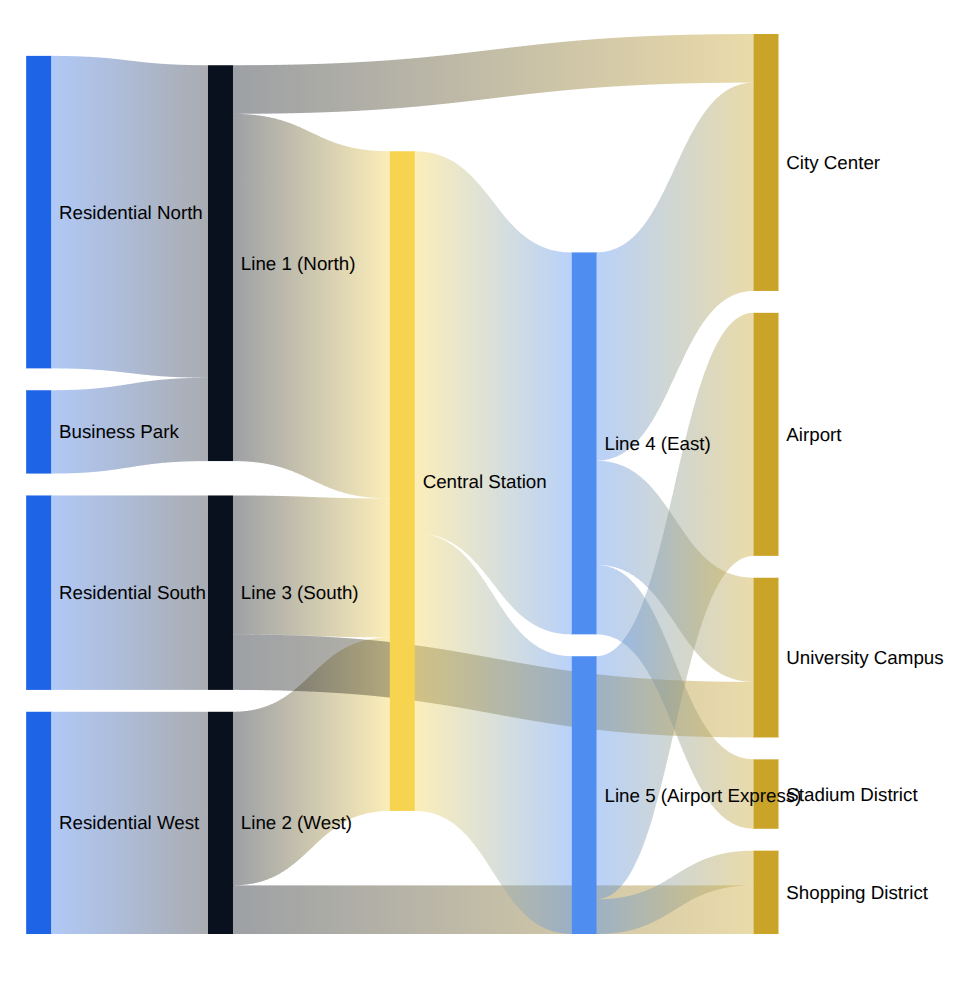
A Sankey diagram lets transit operators instantly see where passenger volume concentrates and flows across the network, which lines feed the busiest transfers, where ridership drops off, and which routes carry disproportionate loads. Operators get an at-a-glance view that supports faster, better-informed decisions on capacity allocation, scheduling, and infrastructure investment.
Connecting the dots with Isarsoft
No single visualization tells the whole story. Dwell time maps show congestion points, trajectories show individual movement, an OD matrix quantifies demand, and Sankey diagrams reveal flow structure. The real value emerges when these fragmented data layers are connected: dwell time at a platform correlates with OD demand into that line, trajectory bottlenecks explain why certain Sankey flows are slower than others, and network-wide origin destination patterns give context to what looks like a local anomaly. Integrated, they form a continuous, end-to-end picture of how passengers actually behave, where they slow down, and why.
This is where video analytics becomes the natural data foundation for the whole stack because they use camera infrastructure, which is already there. Video analytics software like Isarsoft can simultaneously capture people counting, density, dwell time, and movement patterns from the same physical space. That means a single camera view can feed multiple visualization types at once for a full overview over passenger flow. For transit operators, that combination is what turns passenger flow visualization from a reporting exercise into an operational tool for safety, capacity planning, and service quality.
Experience how to elevate passenger flow analysis with existing security cameras.
FAQ
Can't find the answer to your question?
Contact us now!
What types of visualizations show passenger flow in train stations?
Common local visualizations include path-analysis heatmaps showing frequently used routes, dwell-time heatmaps showing where passengers wait longest, and trajectory maps tracing individual movement paths through a station.
What is an origin-destination (OD) matrix used for in public transport?
An OD matrix quantifies how many trips occurred between each pair of stations or zones in a network, feeding directly into demand forecasting, timetable optimization, and capacity planning models.
What does a Sankey diagram show for a transit network?
A Sankey diagram visualizes passenger volume and flow direction across an entire network at a glance, highlighting the busiest transfer points, where ridership drops off, and which routes are disproportionately loaded.
Why is no single visualization enough to understand passenger behavior?
Each visualization captures a different layer: dwell-time maps show bottlenecks, trajectories show individual movement, OD matrices quantify demand, and Sankey diagrams show network-wide flow. Combining them gives operators a complete, connected picture rather than an isolated snapshot.
Can one camera feed multiple types of passenger flow visualizations at once?
Yes. Video analytics software like Isarsoft Perception can simultaneously extract people counts, density, dwell time, and movement data from the same camera view, powering several visualization types from a single physical installation.
Explore More Publications
.png)
On-Camera People Counting & Video Analytics with Isarsoft Perception Axis App
Isarsoft Perception now runs directly on the latest Axis cameras, eliminating the need for additional edge servers. Discover how on-camera analytics is transforming onboard vehicle deployment and opening the door to use cases previously limited by budget or space constraints.

Tackling Overcrowding with Video Analytics for Public Transport
This article explains how overcrowding occurs, highlights the negative consequences of it in public transportation, points out the options either for prevention or measures against overcrowding, and addresses how Isarsoft Perception can be a smart solution.
Automatic Passenger Counting (APC) Systems - An Overview
Discover different technologies for Automatic Passenger Counting (APC) their strengths and weaknesses, and the advantages of the AI-powered solution by Isarsoft.

Automatic Passenger Counting (APC) Systems - An Overview
Discover different technologies for Automatic Passenger Counting (APC) their strengths and weaknesses, and the advantages of the AI-powered solution by Isarsoft.
.avif)
Anomaly Detection in Train Stations using Video Analytics
Isarsoft Perceptions performs anomaly detection in order to help establish safer, more efficient systems in train stations.

Improving Train Station Platform Safety With Video Analytics
Protecting customers, avoiding crowded platforms, and clearing narrow passages are challenges that public transit providers face every day.